I’m here to hopefully convince you that typography means something to the user experience, and will be felt by many visitors. Text is the most common element on a website. In this article I’ll explain what exactly typography is, why it matters, and how you can control the typography on your WordPress sites.
If you’re looking for the slides from my Typography & WordPress presentation, you can find those right here.
I’ll also be going into more detail on some of the presentation shortly in this article as I finish it, but here are some of the broad elements from the presentation.
Typography Does Matter
In the past 30 years, there have been more studies on how typography affects readers than ever. With it, data has shown that the typefaces chosen can make a relatively substantial difference in the reader. With digital marketers focusing often on adjustments with gains of 1% to 2%, typography will only continue to grow as a tool for connecting with audiences.
Choosing Fonts
Finding a good base (anchor) Typeface
- Look for a typeface that works well in paragraph form first. (legibility + readability, large x-height)
- Make sure the typeface has a adequate Family.
- A Family of typefaces are the different styles and weights (italic, bold, bold italic, etc..). Without these weights and styles I’d recommend not using it.
- Many type designers and foundries have descriptions of their typefaces. This can help to figure out what the original designer may have been
Combining Typefaces
Getting the eye for great combinations isn’t easy, and takes time and knowledge. Don’t let that deter you if you have interest. Here are some general suggestions. As with any set of suggestions, there are times it makes sense to ignore them.
- Limit the amount of typefaces you’ll feature on the site to two or three at most.
- Choose typefaces from the same designer or foundry
- A Simple but proven choice is finding “Superfamily” Typefaces
- Droid Sans and Droid Serif
- FF Meta Sans and FF Meta Serif
- Abril Text, Abril Display, and Abril Fatface
- Lucida Sans and Lucida Serif
- Choose typefaces from the same time period.
- In most cases, mixing a very old typeface – for example Blackletter with a new geometric sans can make one of the choices look out of place. While this isn’t always the case, when starting out its best to keep the time period of the typeface in mind.
- If you’re unsure of what fonts work best on your website, try a few to see what you prefer and what you feel is easier to read. Also mix different sizes and line-heights.
- You can also look at some sources online or off, that give some good ideas for typeface combinations
What Can I Do via WordPress?
One of the reasons WordPress is so popular, is the plugin ecosystem. There are some great plugins that help you with your Typography on your WordPress website(s). I haven’t tried them all, but there are some I recommend. Much of the functionality of these plugins can be created within your themes templates and stylesheets, but you can choose either way based on your comfort with HTML, CSS, PHP, and JavaScript.
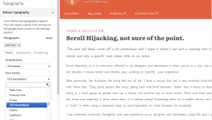
- Easy Google Fonts
- Typekit Fonts for WordPress *requires a typekit account
- Perfect Pullquotes
- more coming soon…